Control Panel Customization
The control panel (CTRL+P or the “rows” button on the left bar to open) lets users see all visual entities at a glance in tabular form and offers default actions.
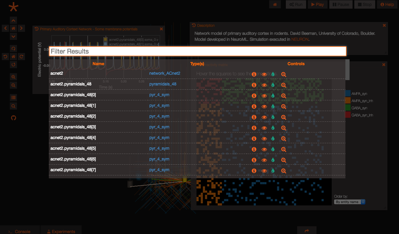 image
image
The control panel can be configured via API to:
- Display custom columns
- Configure which custom controls to show for each row and associate actions to them
- Set data filters
Display custom columns
Columns can be controlled by setting column metadata, as in the following example:
var customColumnMeta = [
    {
        "columnName": "path",
        "order": 1,
        "displayName": "Path",
        "source": "$entity$.getPath()"
    },
    {
        "columnName": "name",
        "order": 2,
        "displayName": "Name",
        "source": "$entity$.getPath()"
    },
    {
        "columnName": "type",
        "order": 3,
        "customComponent": GEPPETTO.ArrayComponent,
        "displayName": "Type(s)",
        "source": "$entity$.getTypes().map(function (t) {return t.getPath()})",
        "action": "G.addWidget(3).setData($entity$).setName('$entity$')"
    },
    {
        "columnName": "controls",
        "order": 4,
        "customComponent": GEPPETTO.ControlsComponent,
        "displayName": "Controls",
        "source": "",
        "action": "GEPPETTO.FE.refresh();"
    }
];

GEPPETTO.ControlPanel.setColumnMeta(customColumnMeta);
The non-self-explanatory fields are explained below:
- customComponent: for data that is not simple text, custom components can be used among those available (list below)
- source: where to get the data, where $entity$ represent the entity for the given row
- action: columns that use custom components may have configurable actions, this varies depending on the custom component
Custom components
Here’s a list of available custom components:
- GEPPETTO.ArrayComponent: displays an array as comma separated clickable items. the action on click comes from the action parameter in the column metadata.
- GEPPETTO.ControlsComponent: displays custom controls in the form of buttons based on controls configuration (see next section). The action here represent a snippet that runs AFTER the action configured in the control configuration runs (useful to trigger refresh actions when something changes).
- GEPPETTO.ImageComponent: displays a thumbnail image, with enlarged preview on hover
Configure custom controls
Custom controls can be configured as follows:
var myControlsConfiguration = {
"VisualCapability": {
    "visibility": {
        "condition": "GEPPETTO.SceneController.isVisible($instances$)",
        "false": {
            "id": "visibility",
            "actions": [
                "GEPPETTO.SceneController.show($instances$);"
            ],
            "icon": "fa-eye-slash",
            "label": "Hidden",
            "tooltip": "Show"
        },
        "true": {
            "id": "visibility",
            "actions": [
                "GEPPETTO.SceneController.hide($instances$);"
            ],
            "icon": "fa-eye",
            "label": "Visible",
            "tooltip": "Hide"
        }
    },
    "color": {
        "id": "color",
        "actions": [
            "$instance$.setColor('$param$');"
        ],
        "icon": "fa-tint",
        "label": "Color",
        "tooltip": "Color"
    },
    "zoom": {
        "id": "zoom",
        "actions": [
            "GEPPETTO.SceneController.zoomTo($instances$)"
        ],
        "icon": "fa-search-plus",
        "label": "Zoom",
        "tooltip": "Zoom"
    }
},
"Common": {
    "info": {
        "id": "info",
        "actions": [
            "G.addWidget(1).setData($instance$)"
        ],
        "icon": "fa-info-circle",
        "label": "Info",
        "tooltip": "Info"
    }
}
};

GEPPETTO.ControlPanel.setControlsConfig(myControlsConfiguration);
GEPPETTO.ControlPanel.setControls({"Common": \['info'\],
"VisualCapability": \['visibility', 'zoom'\]});
Controls can be grouped by capabilities. If an entity has a given capability (VisualCapability in the example above), the controls will be added. All controls specified under “Common” will be added for all the rows regardless of capabilities. The setControlsConfig command set the configuration, while the .setControls command controls which items will be visible (this can be dynamic).
Set data filter
A filter function can be configured to control what entities gets displayed in the grid.
The example shown below illustrates how to show in the control panel only instances of composite types:
var myFilter = function(entities){
    var visualInstances = GEPPETTO.ModelFactory.getAllInstancesWithCapability(GEPPETTO.Resources.VISUAL_CAPABILITY, entities);
    var compositeInstances = [];
    for(var i=0; i<visualInstances.length; i++){
        if(visualInstances[i].getType().getMetaType() == GEPPETTO.Resources.COMPOSITE_TYPE_NODE){
        compositeInstances.push(visualInstances[i]);
        }
    }
    return compositeInstances;
};

GEPPETTO.ControlPanel.setDataFilter(myFilter);
Refreshing the control panel
All the API methods that change the state of the control panel cause the control panel to re-render so it not necessary to trigger manual refresh when interacting with the control panel via the API.
However if something has changed in the state of the instances and the control panel hasn’t been closed and re-opened a manual refresh can be triggered via script:
GEPPETTO.ControlPanel.refresh();